

Canadian datacrimes
Canadian datacrimes
Or just incomplete records? But that's not exciting...

Dr. Jessica Rose recently wrote about the uptick in all-cause deaths in New Brunswick, and to a lesser extent, in Alberta. So I downloaded the data and ran it through matplotlib.pyplot, because, well, Python.

Then one of her paying subscribers (we non-payers cannot comment) pointed out that Ontario’s numbers were down, and so the next day a new post revisited the data.
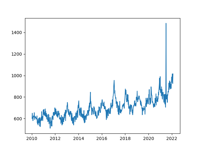
So, I decided to show my own plots, for each province and for Canada as a whole.
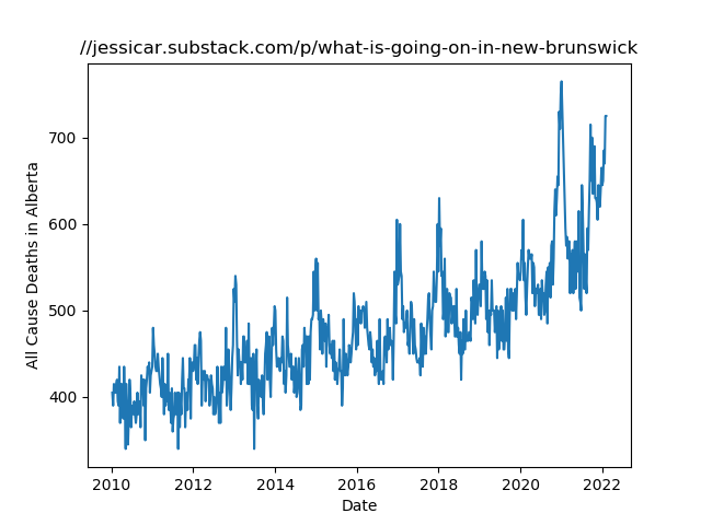
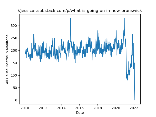
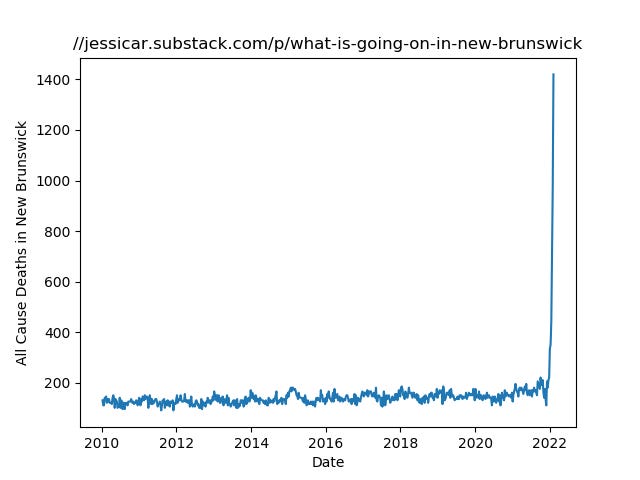
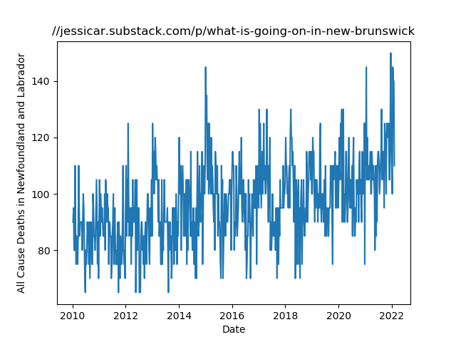
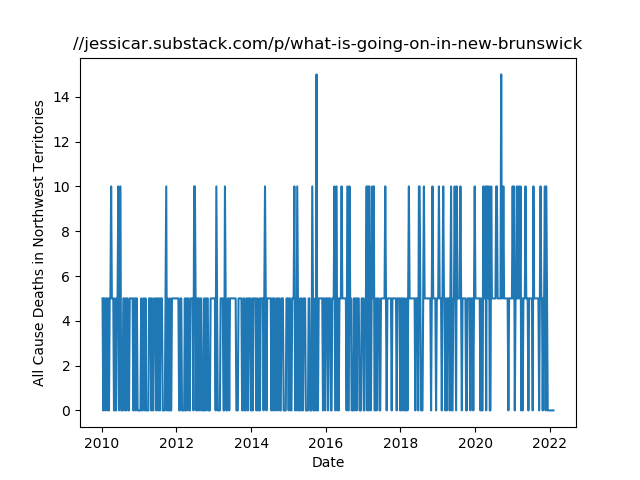
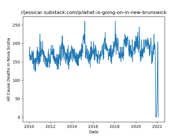
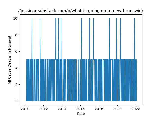
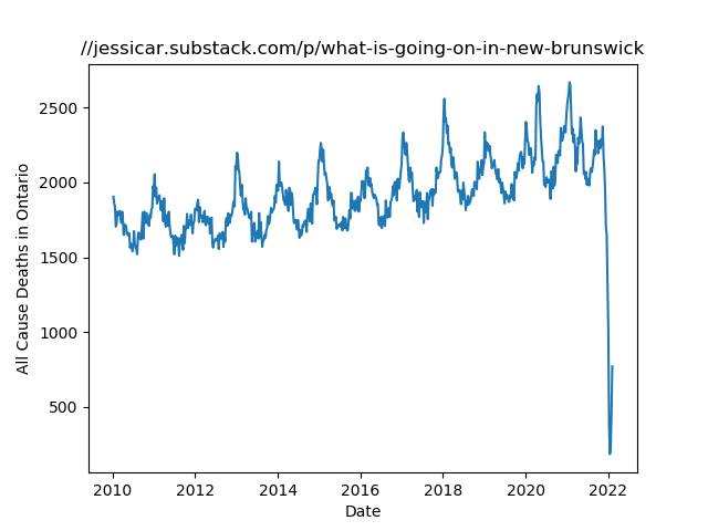
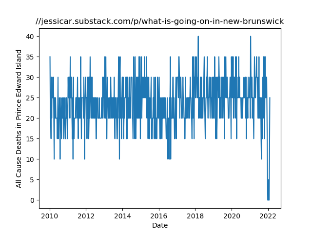
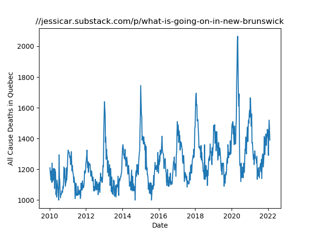
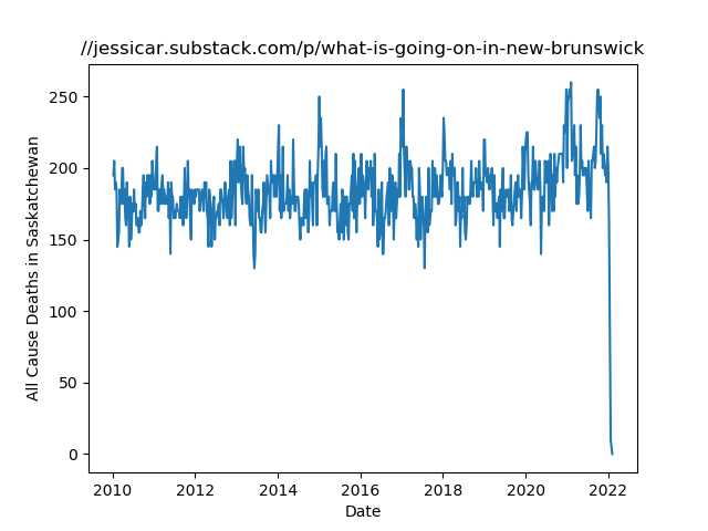
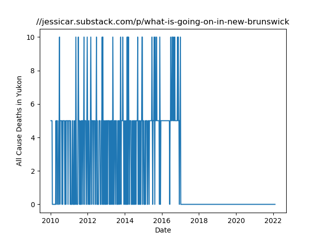
Some notes on the above: Alberta, British Columbia, New Brunswick, and Newfoundland show a scary rise correlating to the vaccine rollout. All others show a precipitous drop in all-cause deaths. Yukon apparently hasn’t sent any data at all since early 2017. Many of the provinces show no sign that a pandemic ever took place.
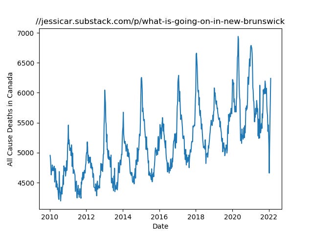
And here is Canada as a whole. Note the general uptrend in deaths over the years, the double-peak and shallower trough in 2020 for covid-19, and chaotic 2021 and 2022 with an anomalous drop on Janary 8th to 4660: a low not seen since 2017. A lot of the chaos can arguably be attributed to Nova Scotia and Manitoba, whose charts appear to be missing a lot of more recent data.
Hopefully, better minds than mine can make some sense of this. In closing, here’s the Python script I whipped up. Convoluted, like my thinking processes: https://github.com/jcomeauictx/statscanada
👀
Hmm, the formatting is all wrong on the Python script. And I don't know how to fix it.